

Project Overview:
The Product:
FitConnect is a smartphone application that helps fitness enthusiasts connect with others in their community to challenge and achieve their fitness goals. Users will have the ability to instantly message their friends through FitConnect and be able to explore the different running clubs and groups within the local area they live. They will also be able to track various running data, such as the distance they run and the calories they burn.
The Problem:
Studies have shown that on fitness-related apps, users are more likely to delete the apps a few weeks after downloading if they cannot communicate with others. Users do not only need a fitness running app that helps them keep track of their running data and helps them achieve their fitness goals, but also enables them to feel like they belong to a larger community of friends who will help challenge them to accomplish their goals.
My role:
UX Designer and Researcher, designing an app for FitConnect from research, to conception, to designing and testing prototypes.
The Solution:
Design a smartphone application that gives users the ability to not only track their running fitness data, but also the opportunity to join local run clubs and groups, and have the ability to connect with other friends on the app. FitConnect helps users feel like they belong to a larger community where they can challenge friends to certain running routes and invite friends to join local running groups.
Responsibilities:
Conduct user research, create low-fidelity and high-fidelity prototypes, and conduct interviews to gather feedback on app usability and user experience.
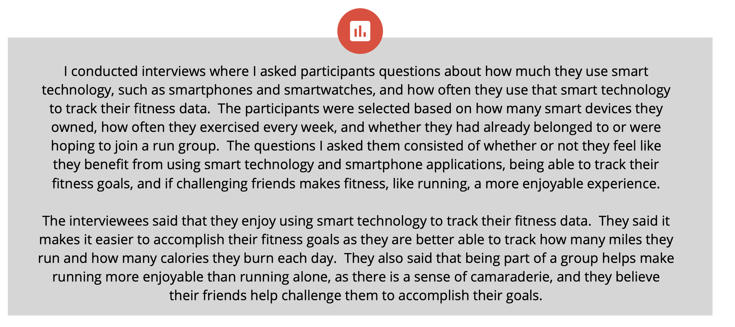
Conduct research: summary
Create User Flows
User Flow Routes:
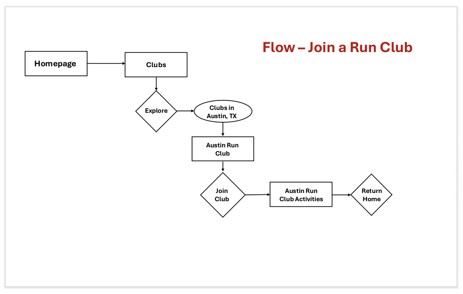
Different user flows were created to help reflect what runners were looking for in a fitness running app that makes them feel like they belong to a larger community. These user flows were created so that as a designer, I would better know how to design these flows in the wireframes of what path the user needed to follow. “Joining a run club” was one of the flows created, where the user will have an easy, straightforward experience of exploring different run clubs in their area and joining a club.
Low-Fidelity Designs
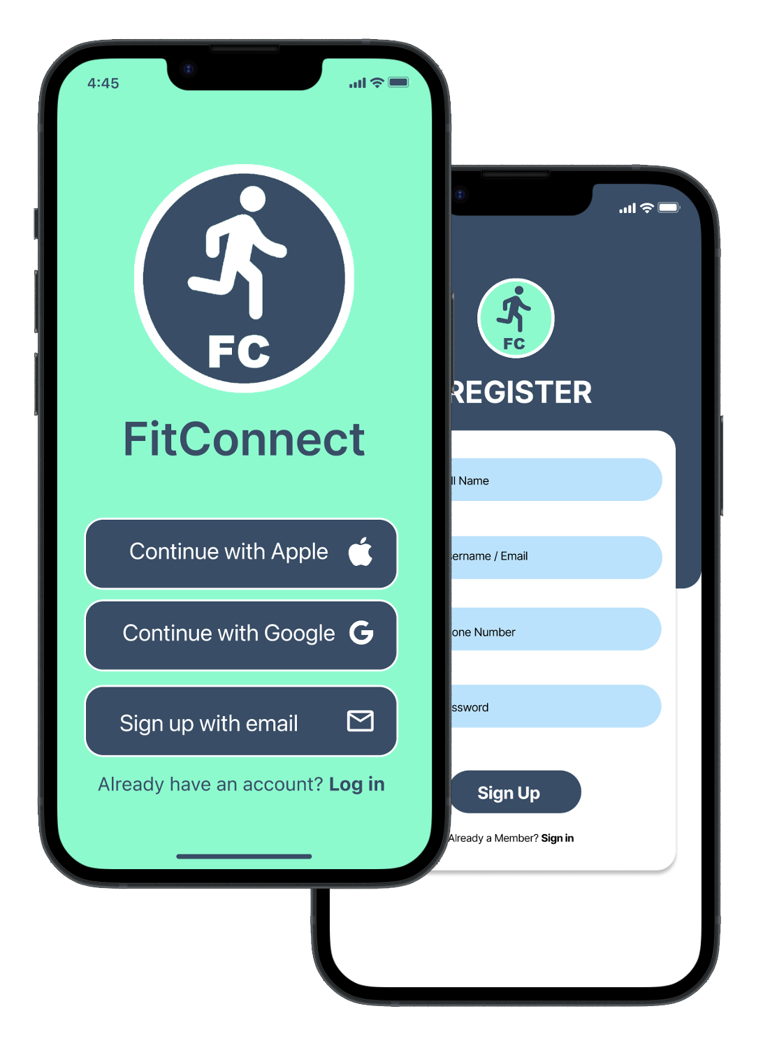
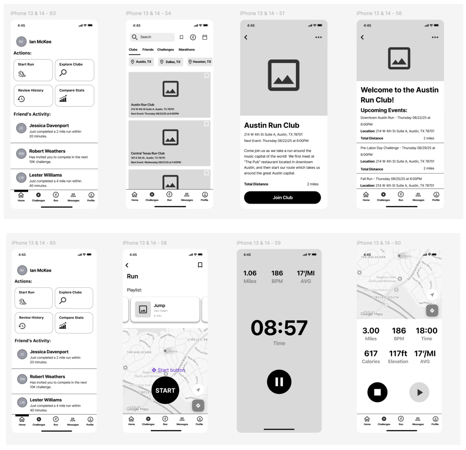
The next step involved turning the user flows into low-fidelity designs. The low-fidelity designs were black and white and were aimed to address the issues and pain points that were discovered during the research phase. A welcome page was designed, as well as a homepage/dashboard screen, which would give users different options such as starting and ending a run, or exploring the different run clubs available in their area. The messaging feature was made available not only on the homepage dashboard but also on the bottom navigation bar, so users could immediately message anyone at anytime.
First Round of Usability Testing
Usability tests were conducted to help validate the designs. The participants were in the age range of 18 to 75 years old, were owners of smart technology such as a smartphone and smartwatch, and exercised regularly around three to five times per week. The participants enjoyed using the low-fidelity prototype for the most part, as they thought the flows were straightforward to use. They thought the screens were well organized and nicely designed. They also enjoyed how they were able to explore the different running clubs that were offered within the local area they lived in, and felt like having the instant messaging feature helped give them a sense that they belonged to a larger running community.
Usability Test Findings:
Low-Fidelity Designs
Low-Fidelity Screens:
The next step involved turning the user flows into low-fidelity designs. The low-fidelity designs were black and white and were aimed to address the issues and pain points that were discovered during the research phase. A welcome page was designed, as well as a homepage/dashboard screen, which would give users different options such as starting and ending a run, or exploring the different run clubs available in their area. The messaging feature was made available not only on the homepage dashboard but also on the bottom navigation bar, so users could immediately message anyone at anytime.
Second Round of Usability Testing
After completing the high-fidelity designs, a second round of usability testing was conducted with different participants. The participants in the second round still met the same criteria of being in the age range of 18 to 75 years old, owners of smart technology such as a smartphone and smartwatch, and exercising regularly around three to five times per week. The participants enjoyed the high-fidelity designs, as they thought the designs were well-organized and liked the different color choices, such as aquamarine. They thought the design had a nice aesthetic, and the photos that were used for the other running clubs were effective in making the user feel like they could belong to a larger running group.
Usability Test Findings:
Iterate on High-Fidelity Designs
Iteration of High-Fidelity Screens:
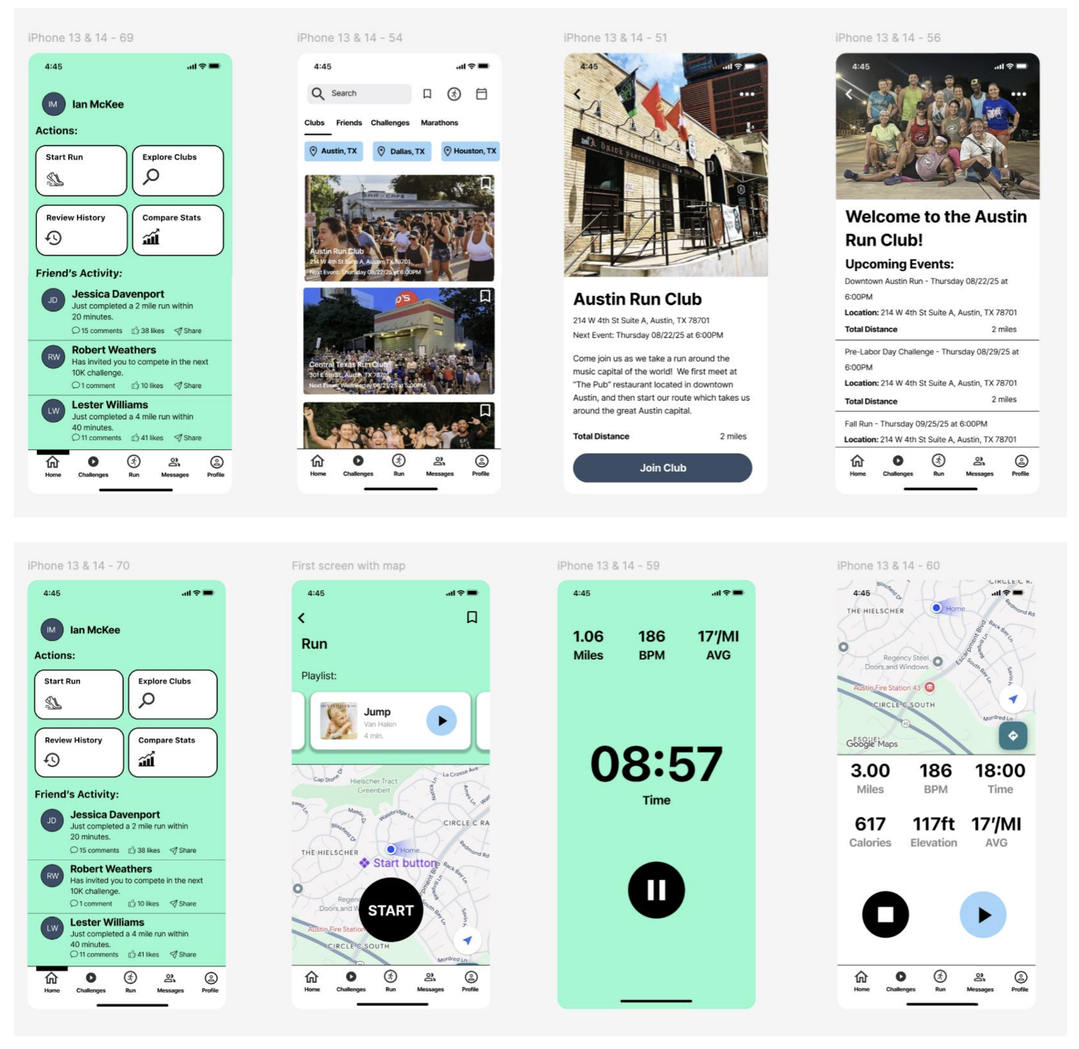
After completing the second round of usability tests with the high-fidelity prototype, further edits were made to help improve the overall design and experience of the FitConnect app. The welcome screen was changed to help enhance the branding and identity of FitConnect. The logo was made more prevalent and the aquamarine color was used in the background on the welcoming screen. This also connects more to the login and signup page to create a consistent use of colors throughout the application.


The aquamarine color was included in the background of the dashboard homepage as well. This is the ”message a friend” route, where the user can select “messages” and it takes them to the friends messaging screen on the app.

In the “join a run club” route, the user selects “explore clubs” on the dashboard homepage, then it lists the different clubs within the area they live in, and they follow a straightforward process to join a club.
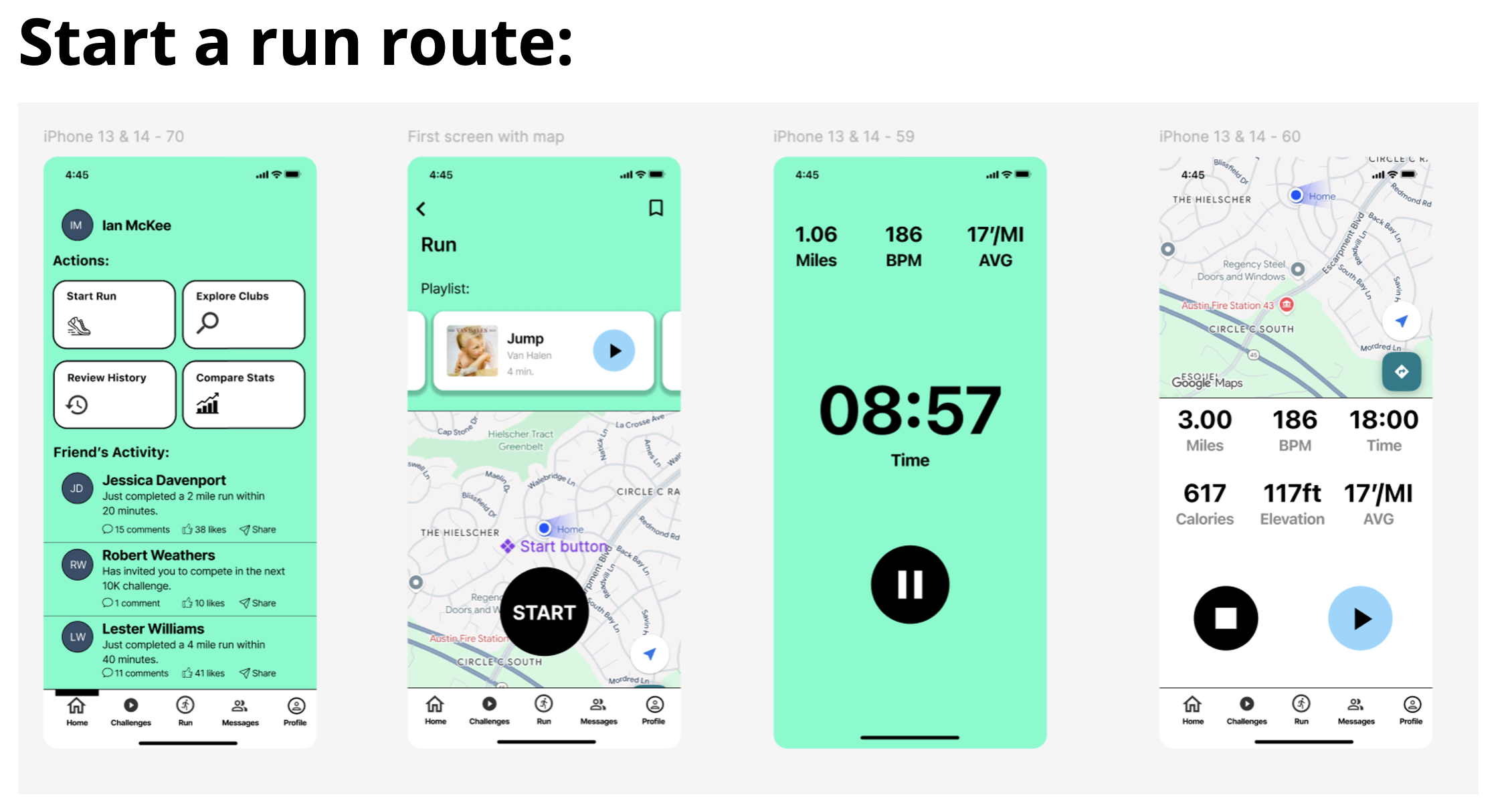
In the “start a run” route, they select the “start run” button from the dashboard homepage, and the screen shows them a map of where they are at. They select “start”, and then the app starts to track the time they are running, miles, heartbeats per minute, and their average mileage. After they are done, they are taken to a page that shows the statistics for that run.
Accessibility Considerations


Takeaways
Impact:
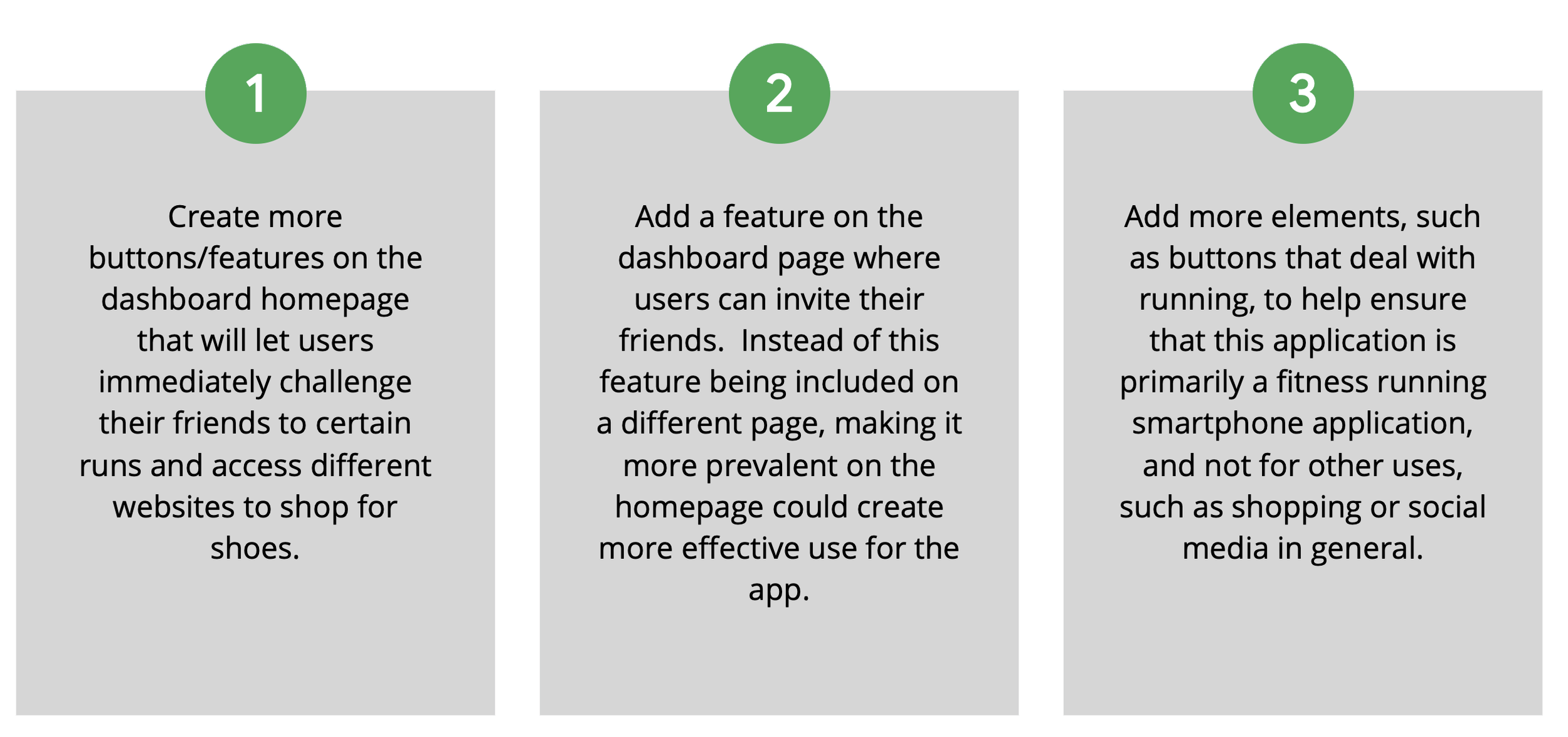
Users enjoyed this smartphone application as they thought it was not only effective for being able to track fitness running data, but also for being able to invite friends and join local running clubs. They believe that the application’s overall atmosphere is friendly and welcoming, and includes nice features such as being able to shop for shoes. There is still room for improvement, such as making certain features more prevalent on the homepage, i.e. as inviting friends and shopping for shoes.
Next Steps
What I learned:
This process has given me a greater insight into how the overall design process works, from conducting research to designing low-fidelity prototypes, testing those prototypes, and then taking those results and turning the low-fidelity designs into high-fidelity designs. It has made me realize how valuable users’ feedback is and why it is important to help test your product and try to create the best user experience possible for a smartphone application.
